BUILDING CINEMATIC
DIGITAL ART
From the first reference image to the final Photoshop composite. Every step. Every decision. Exactly how I work after 15 years.
REFERENCE &
MOOD BOARD
Before I open Maya or Unreal Engine, I spend 10 to 15 minutes on reference. This is not optional. The reference shapes everything: mood, lighting direction, colour palette, composition, atmosphere. Most beginners skip this or treat it as a quick browse. Professional artists treat it as a creative brief.
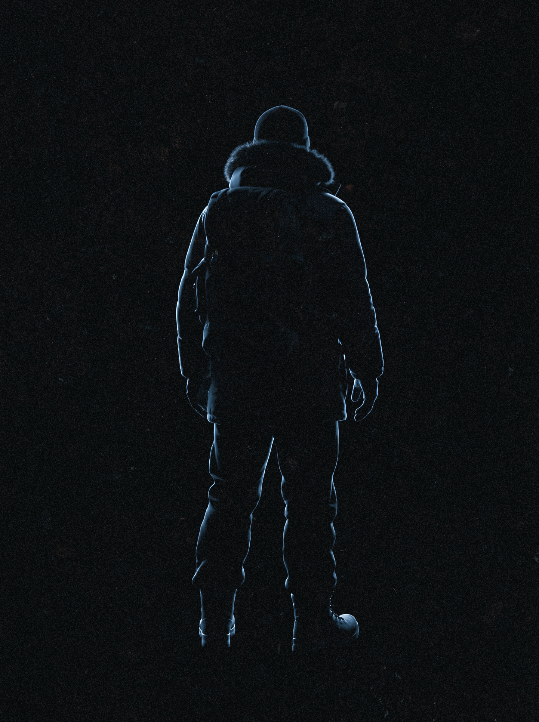
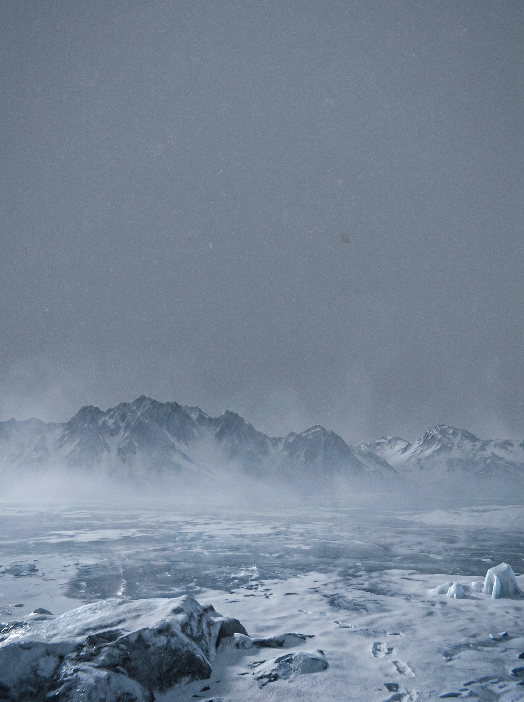
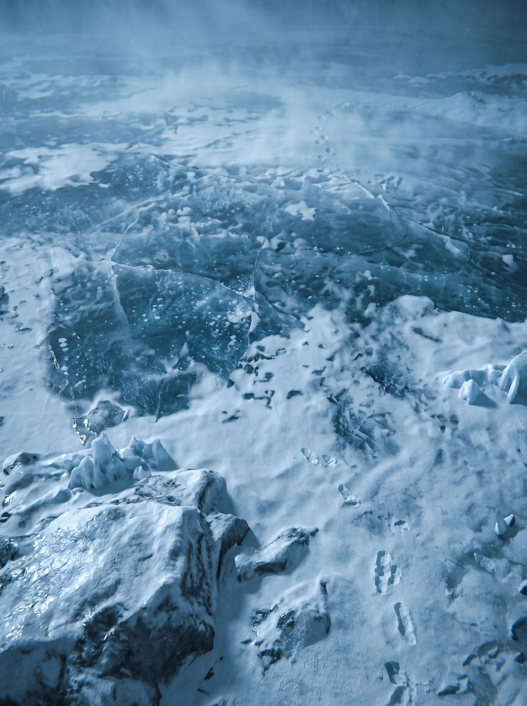
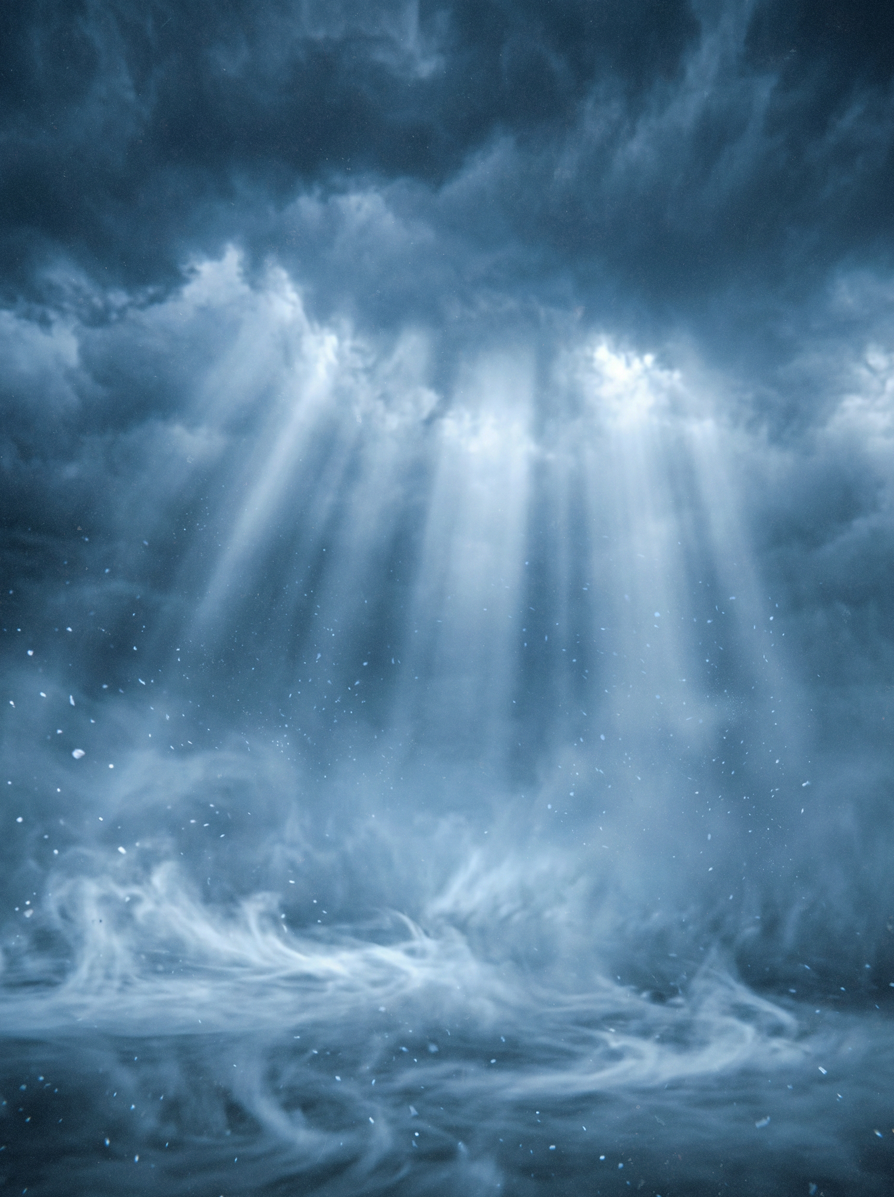
I do not look for images to copy. I look for images that tell me how a specific mood is built. If I want cold and isolated, I find references that achieve that feeling. Then I understand the technical decisions behind it and apply them to my own concept.
CONCEPT
DEVELOPMENT
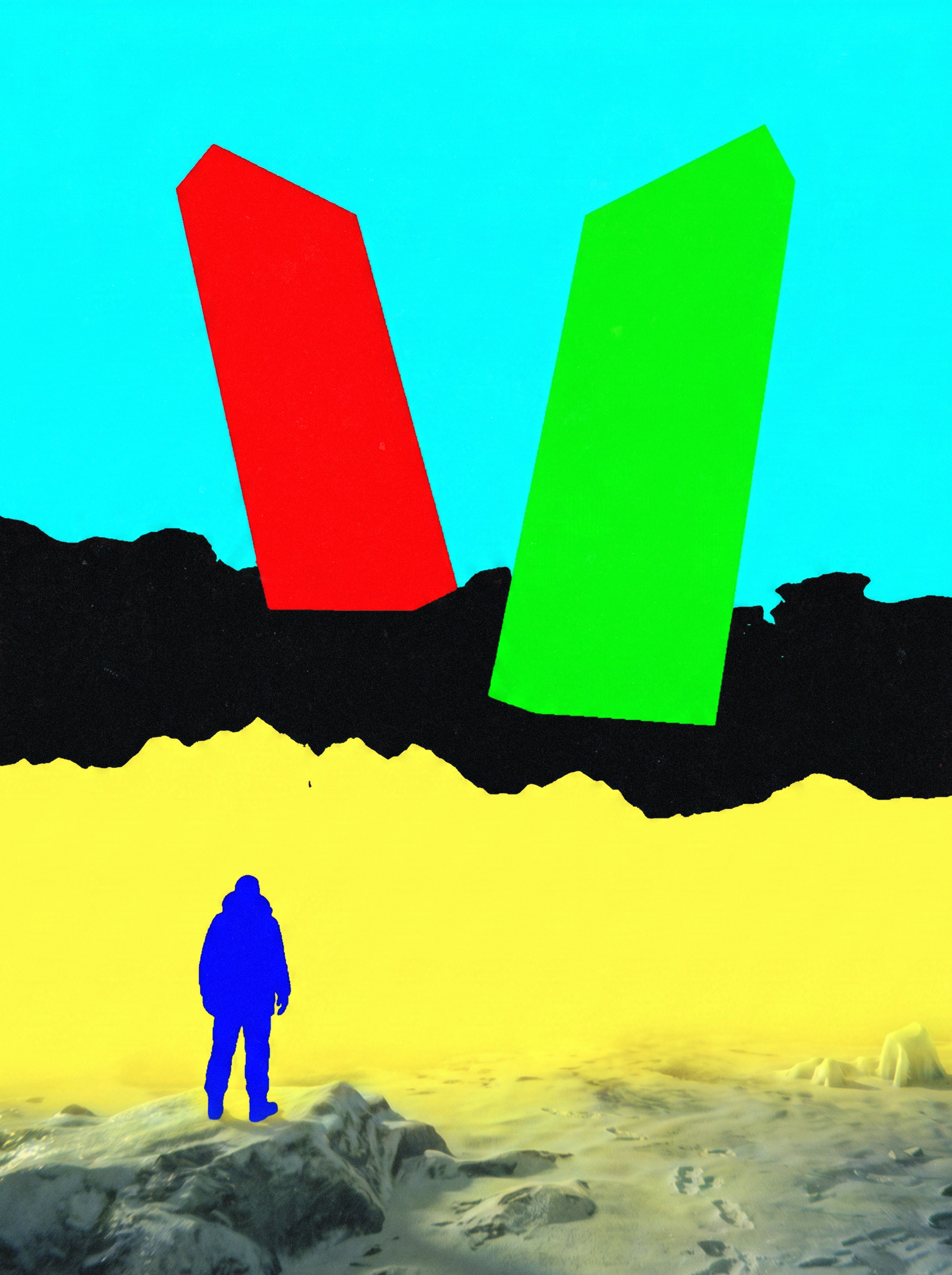
The concept stage happens entirely in 2D, before any 3D software opens. Reference is the starting point, not the destination. This is the most creative stage and it should answer one question: what should the viewer feel?
Before moving to 3D, answer this: what should the viewer feel when they see the finished image? Name it specifically. Not "cool" or "dramatic", but "isolated", "overwhelmed", "afraid", "curious". Every technical decision that follows serves that answer.
MODELING
& ASSETS
I model to my concept, not beyond it. If the camera will never see the back of an object, the back does not need detail. The most common beginner mistake: spending too long on modeling before the composition is locked.
Hero objects the camera focuses on. High-detail foreground elements. Anything with a unique silhouette. Proprietary client assets.
Background filler: rocks, debris, vegetation. Repeating environment elements. Architectural details not in the hero zone. Standard props with no unique requirement.
TEXTURING
I use 2K to 4K textures maximum. A well-lit scene with 2K textures will always outperform a poorly lit scene with 8K textures. The material properties I care about most are roughness and reflectivity. These define how light interacts with the surface.
| Property | Maya (Redshift) | Unreal Engine 5 | Notes |
|---|---|---|---|
| Base Color | rsStandard: Diffuse Color | Base Color input | Reference-matched |
| Roughness | Refl. Roughness | Roughness input | 0.2 to 0.9 for most surfaces |
| Metallic | Refl. Weight + low Roughness | Metallic input | 0 or 1 only. Never 0.5 |
| Normal Map | Bump Map input (0.3 to 0.8) | Normal Map (DirectX) | Subtle support only |
SCENE BUILDING
& STAGING
Scene building is where your concept sketch becomes a 3D space. The goal: confirm that your composition works in 3D before investing time in lighting and shading. I work in a grey clay view, no materials, no textures, no lighting beyond a basic ambient.
If the composition does not work in clay, lighting will not save it. Fix composition here, not in Photoshop. Every hour spent here saves three hours later.
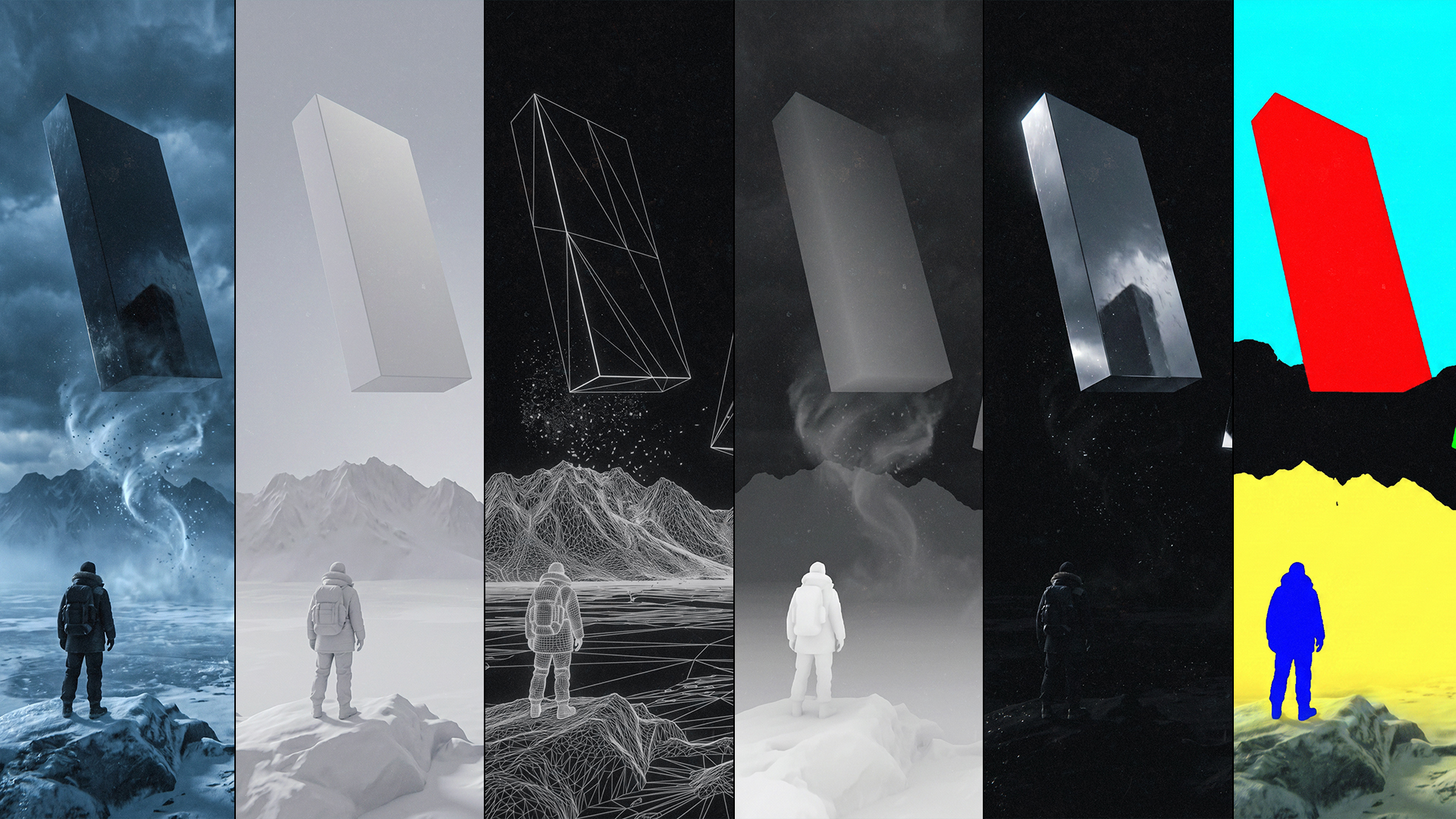
Left: wireframe confirms clean geometry. Right: greyscale confirms the lighting reads without colour. Both checks must pass before look development begins.
CAMERA &
FOCAL LENGTH
I use focal lengths between 12mm and 120mm depending entirely on the scene. This is a storytelling decision, not a technical preference. The camera is locked before look dev begins. Any movement after means redoing everything.
| Focal Length | Feel | Best For | Risk |
|---|---|---|---|
| 12 to 24mm | Wide, exaggerated depth, dramatic scale | Environments where scale is the story | Distortion at extreme edges |
| 35 to 50mm | Natural, human perspective | Balanced shots, familiar scale | Can feel flat without lighting depth |
| 85 to 120mm | Compressed, cinematic, shallow DOF | Portrait subjects, isolated elements | Background detail lost, needs atmosphere |
LOOK
DEVELOPMENT
Most beginners finish all materials, then add all lights, then adjust shaders. Professional look development does not work this way. Materials, lighting, and shaders are developed together, each influences the other.
rsStandard material for 90% of everything. Diffuse, reflective, metallic, all in one node.
UE5 is real-time, iterate much faster. Place directional light first, connect to Sky Atmosphere.
Primary source. Defines shadow direction and emotional temperature. Warm or cold. This is the mood decision.
Reduces shadow darkness. Never competes with key. Often opposite colour temperature. Cold fill + warm key = cinematic depth.
Behind or beside the subject. Separates from background. Makes figures feel like they exist in the world, not floating in front of it.
RENDER
SETUP
| Setting | Value | Notes |
|---|---|---|
| Resolution | 1920 x 2400 px | Portrait 3:4, standard for this style |
| Renderer | Redshift Bucket | IPR for iteration, Bucket for finals |
| Output Format | EXR 32-bit | Preserves all data for compositing |
| Sampling | 128 to 256 finals / 64 iteration | Balance quality vs speed |
| Global Illumination | Brute Force + Brute Force | Highest quality for hero renders |
| Denoiser | Redshift OptiX ON | Cuts render time 40 to 60% |
| Setting | Value | Notes |
|---|---|---|
| Resolution | 1920 x 2400 | Custom: set in Output Settings |
| Anti-Aliasing | Temporal Super Sampling | 64 to 128 samples for finals |
| Output Format | EXR Sequence | EXR for compositing, PNG for quick review |
| Path Tracer | Enable for hero stills | Highest quality, slower but superior |
| Motion Blur | Disabled | r.MotionBlurQuality 0 for stills |
RENDER PASSES
& COMPOSITING
A render pass isolates one visual property: depth only, reflections only, ambient occlusion only. In composite, you layer these passes with different blend modes to build a result that gives you precise control over every element independently.
There is no fixed number. I have built finals with 3 passes and with 11. The scene tells you what it needs. Simple scene: 3 to 4. Medium: 5 to 7. Complex: 8 to 12.
Base layer. All materials, lighting, atmosphere combined. Desaturate it. If it does not read in greyscale, the lighting has failed.
Grounds objects physically. Without AO subjects float. Darkens corners, crevices, and contact areas. Highest impact per render time.
Isolates specular highlights and surface reflections. Control reflection intensity and colour independently without re-rendering.
Grayscale depth. White near, black far. Drives depth of field in composite. Grade foreground vs background independently.
Subtle glow on silhouette edges. Makes subjects feel like they physically exist in the light environment rather than floating.
Isolated character render. Allows independent grading, rim light enhancement, and brightness control in composite.
Background without foreground elements. Grade environment independently. Control atmospheric haze and colour temperature separately.
Upper atmosphere, sky, and cloud layer. Control sky brightness and colour independently from the rest of the scene.
Additional sky effects, god rays, cloud layers. Composited separately for maximum intensity control.
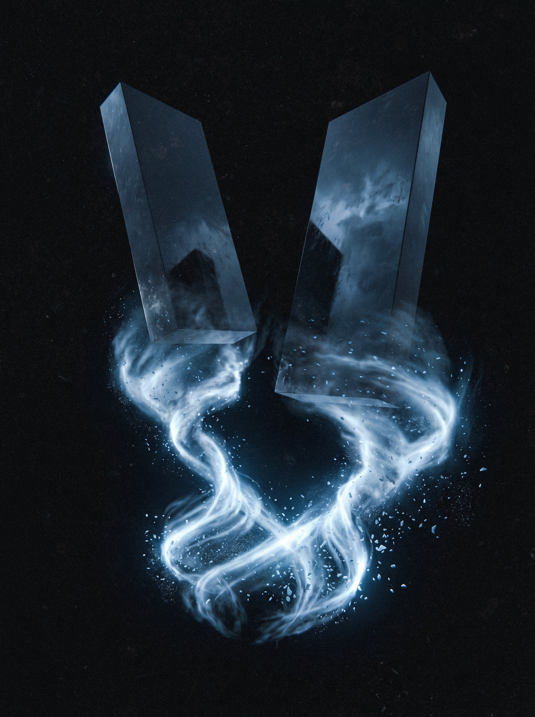
Isolated particles, debris, energy effects. Screen blend makes black transparent. Only bright effect elements appear in composite.
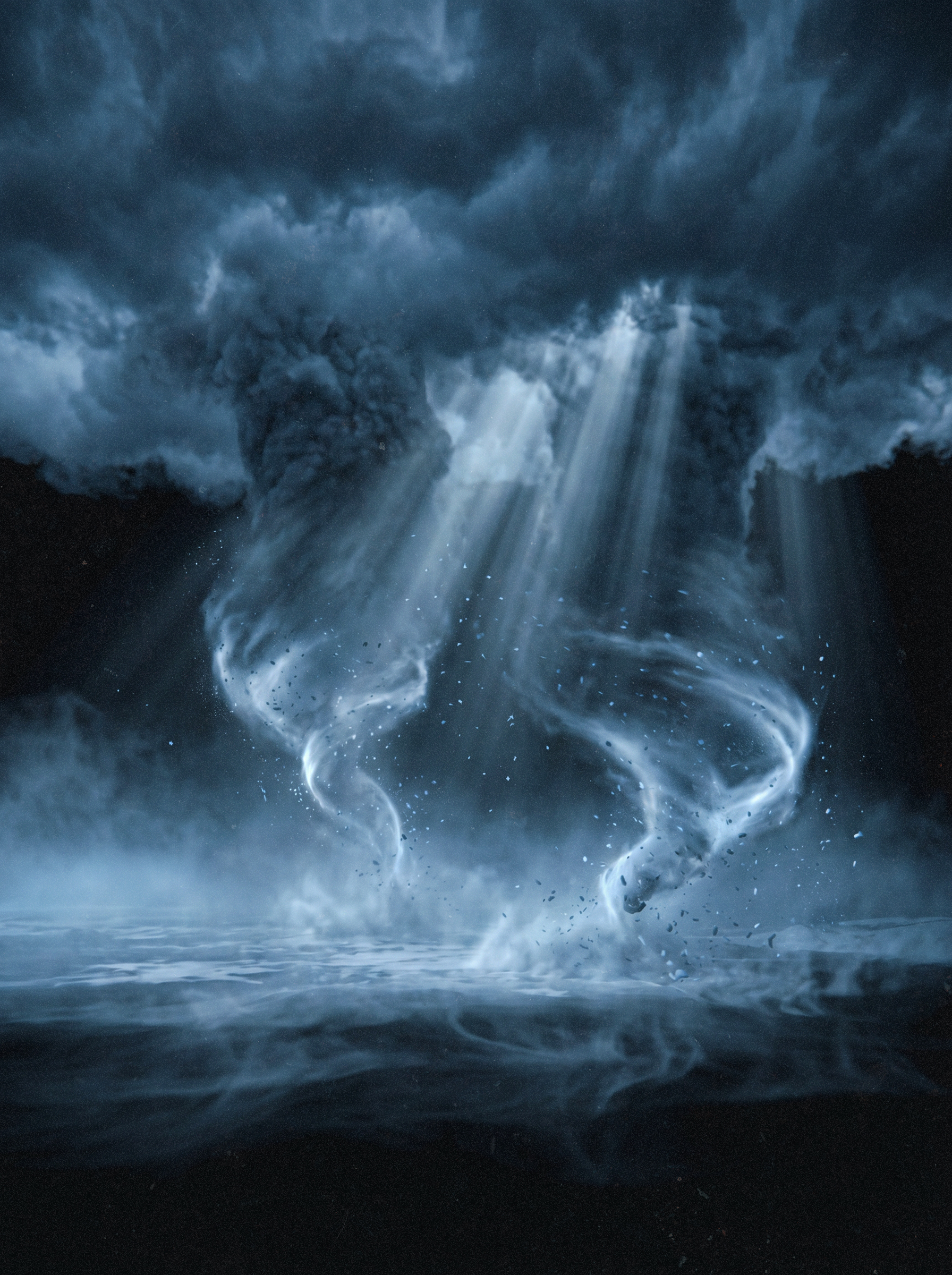
Volumetric light rays, god rays, fog. Never skip volumetric atmosphere. Screen blend at 60 to 100%.
Flat solid colour per object. Used as Photoshop selection masks for independent colour grading without re-rendering.
FINAL PHOTOSHOP
FINISHING
Compositing is where passes become a final image. The order matters, each layer builds on the one below it.
| # | Layer | Blend Mode | Notes |
|---|---|---|---|
| 01 | Beauty Pass | Normal / 100% | Base, everything above this |
| 02 | AO Pass | Multiply / 50-70% | Contact shadows, grounds objects |
| 03 | Environment Layer | Normal / masked | Grade ground independently |
| 04 | Sky Layer | Normal / background | Full sky colour control |
| 05 | Atmosphere Pass | Screen / 60-100% | Volumetric depth, never skip |
| 06 | Specular Pass | Screen / 70-100% | Boost or reduce reflections |
| 07 | Fresnel Pass | Screen / 30-50% | Subtle edge glow |
| 08 | Light Diffuse | Soft Light / 30-50% | Adjust lighting mood |
| 09 | FX Elements | Screen / 100% | Black disappears, glow stays |
| 10 | Character Layer | Normal / masked | Rim light enhancement |
| 11 | Film Grain | Overlay / 15-25% | Ties all layers, never skip |
| 12 | Vignette | Multiply / 30-50% | Dark edges, focus eye to centre |
| 13 | Lens Flare | Screen / as needed | Only if dominant light source visible |
| 14 | Colour Grade | Curves / Sel. Color | Final push, cold blues, crush blacks |
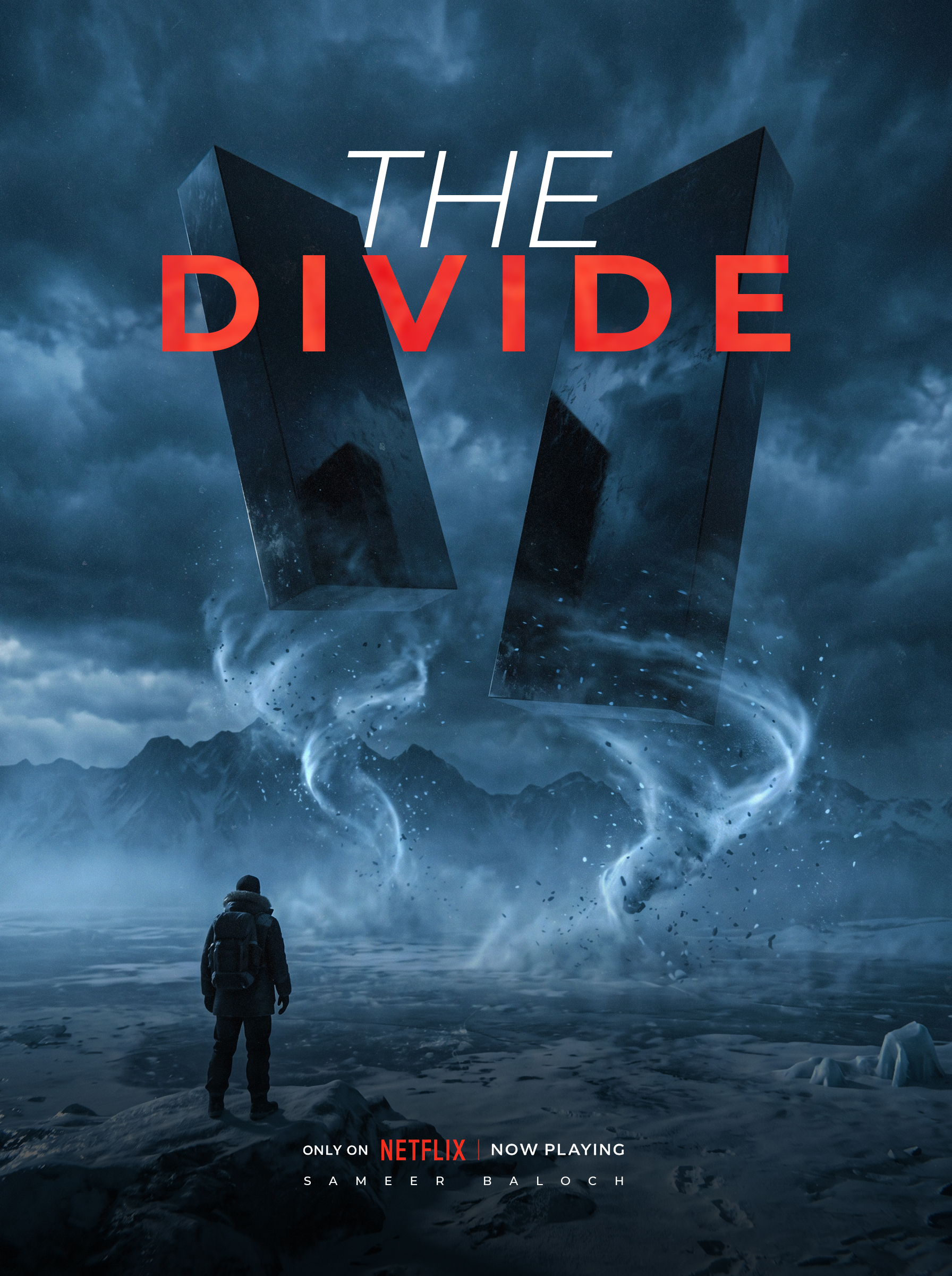
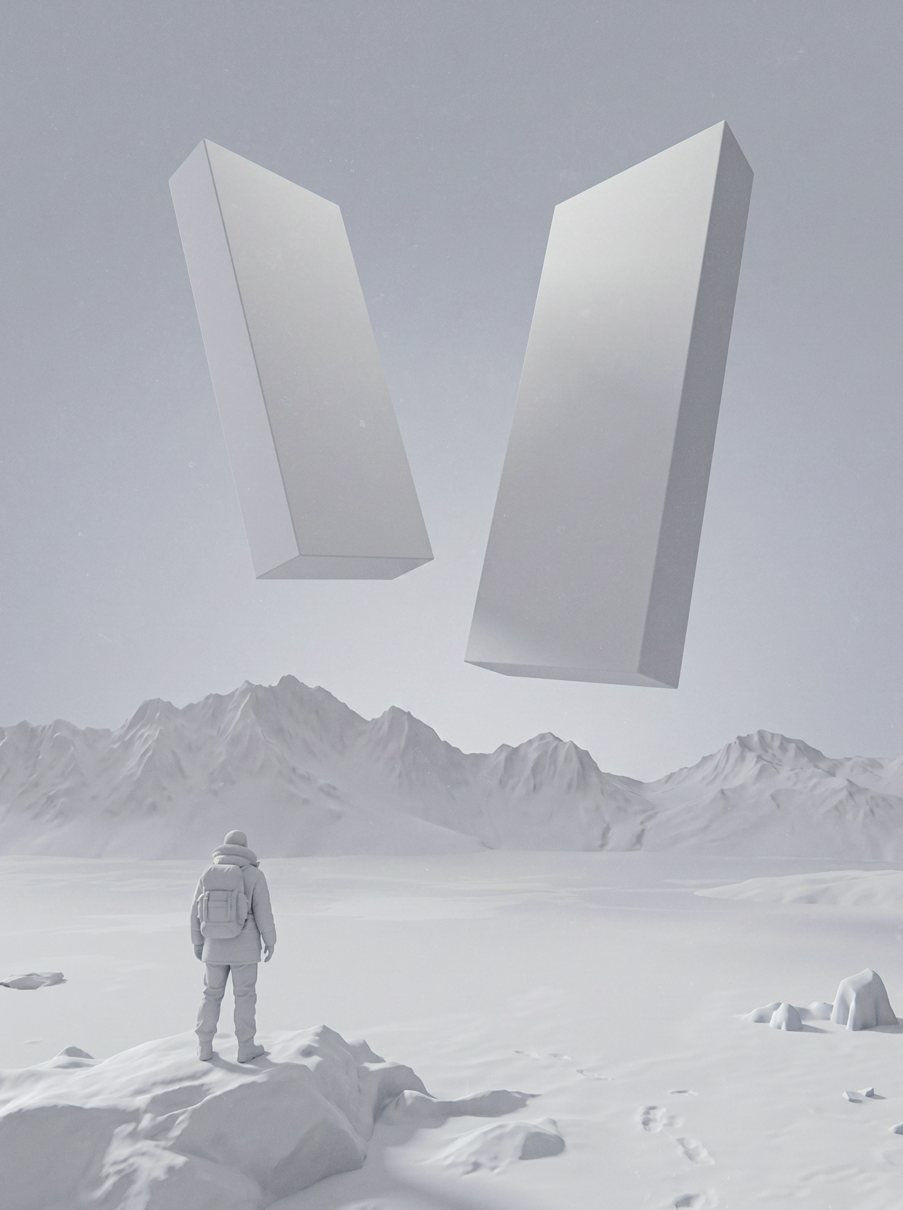
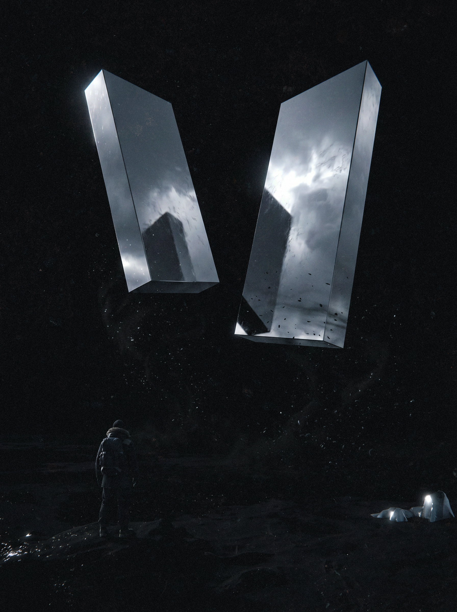
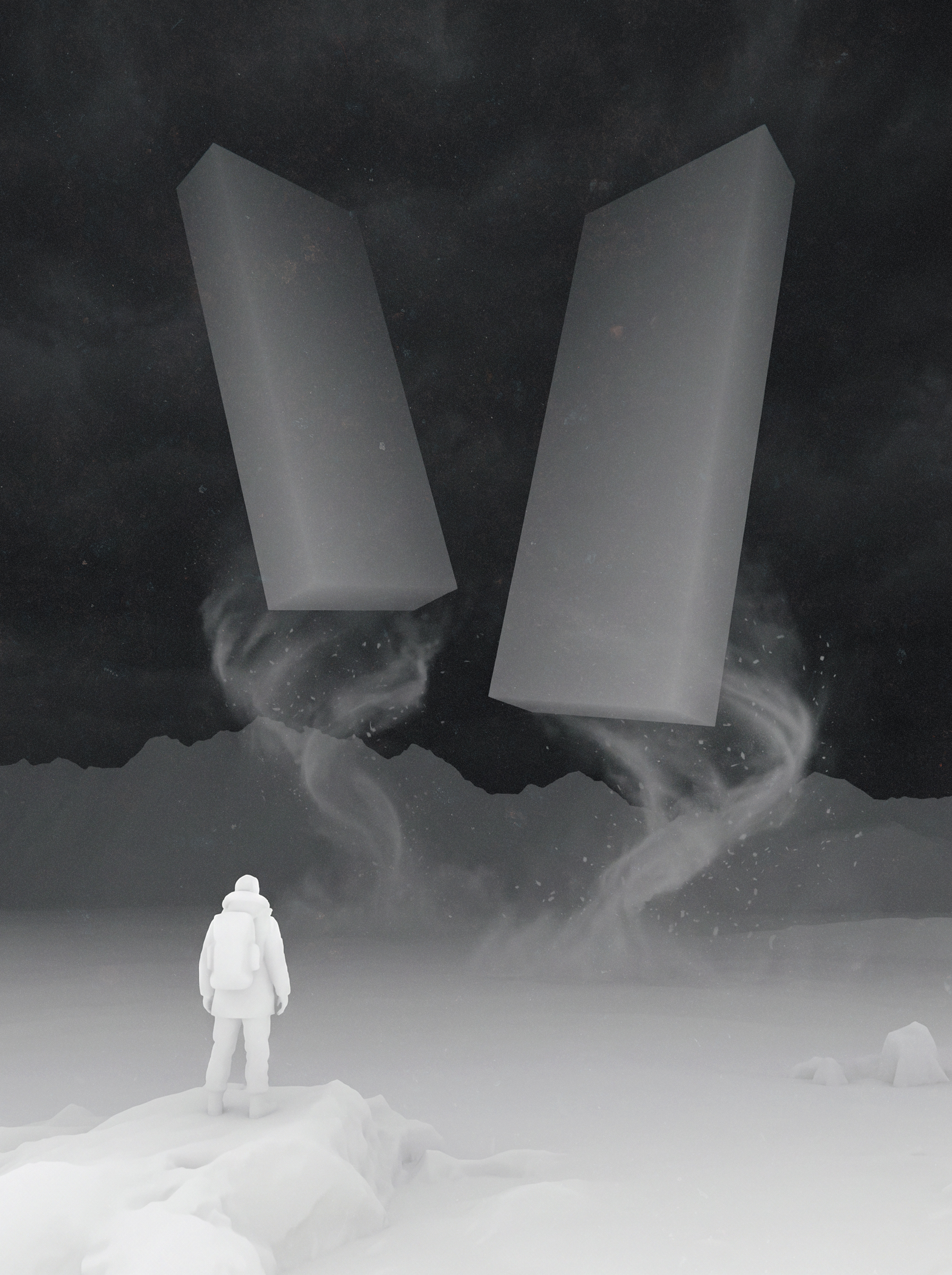
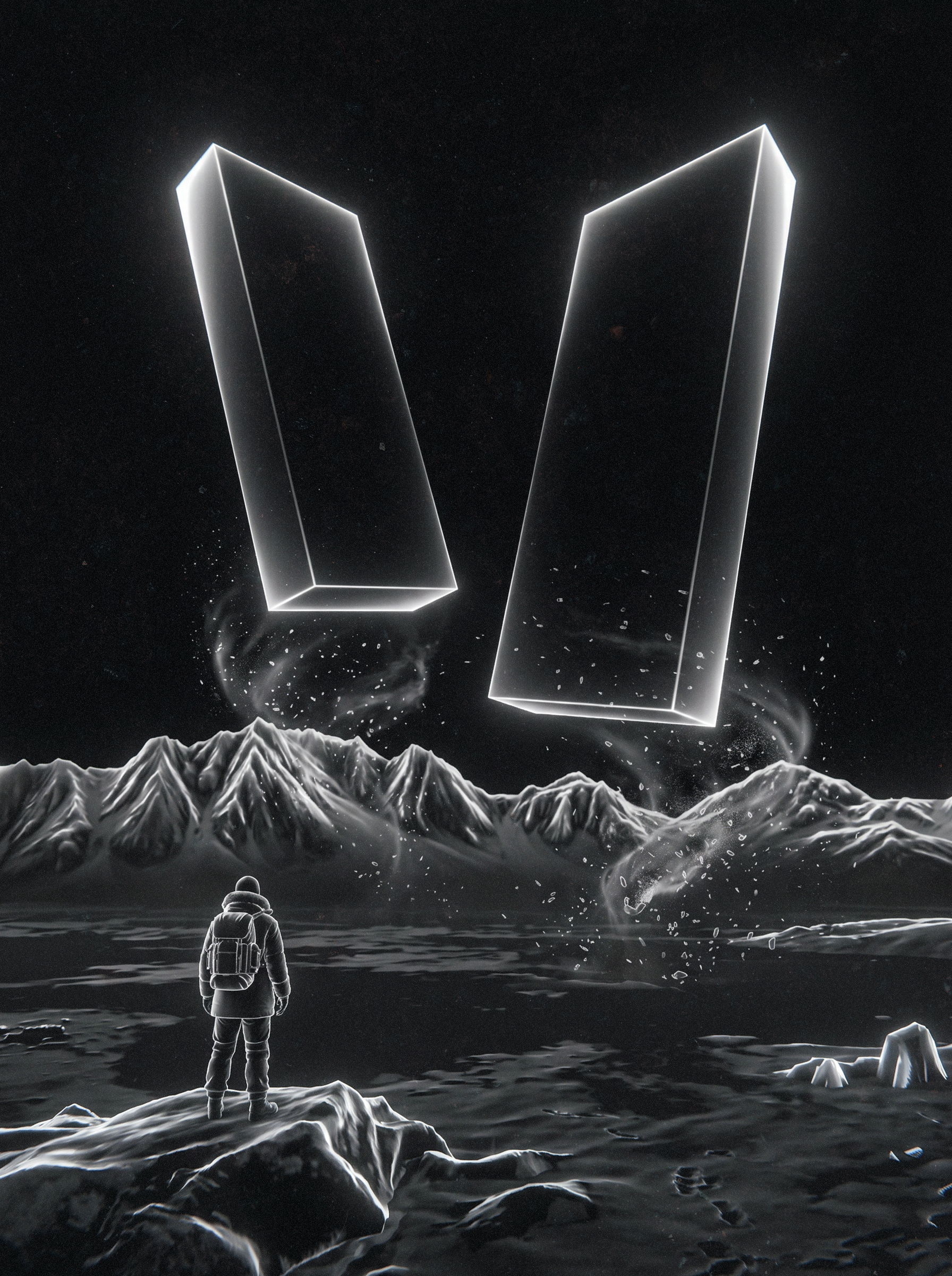
THE DIVIDE
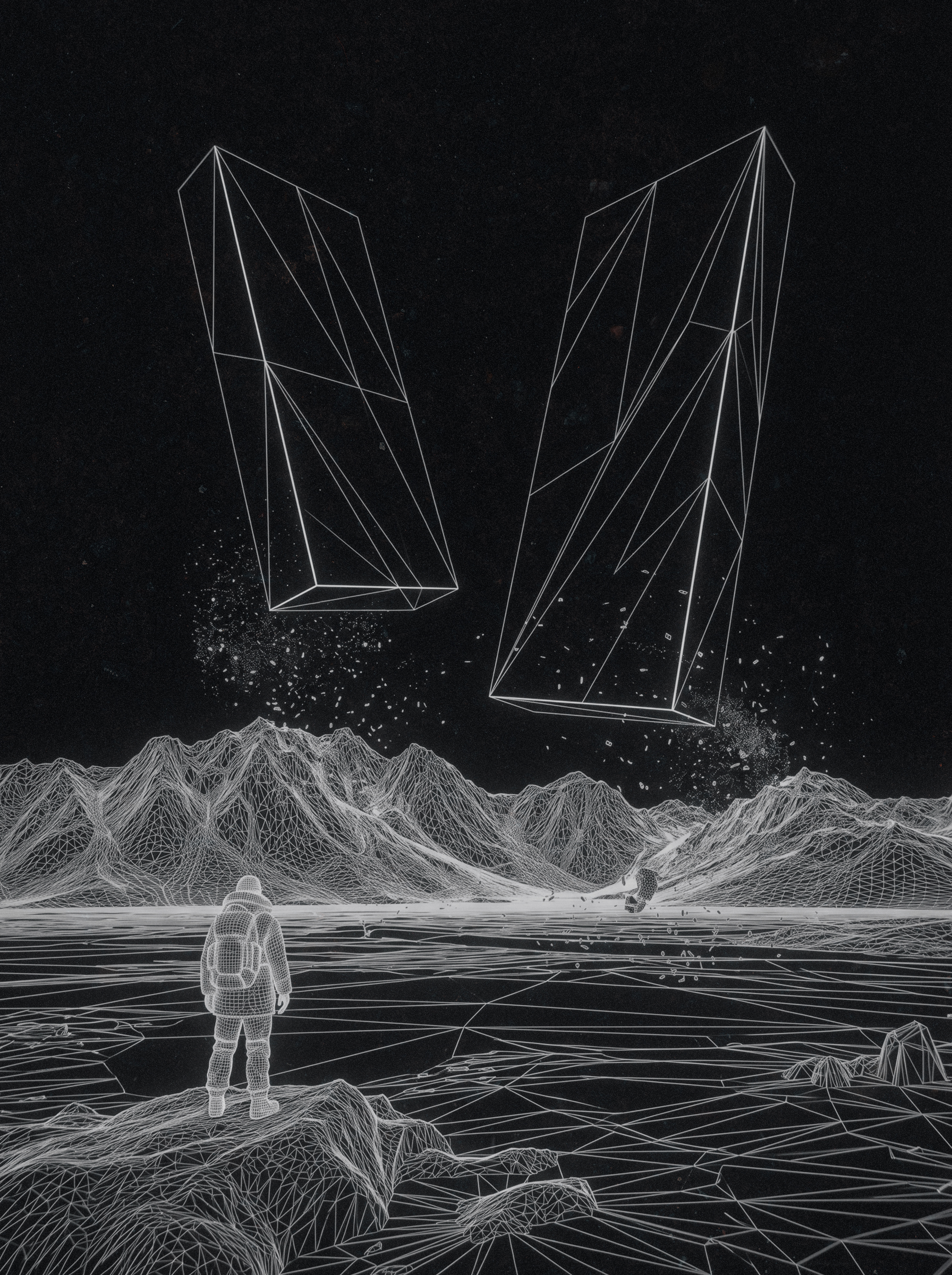
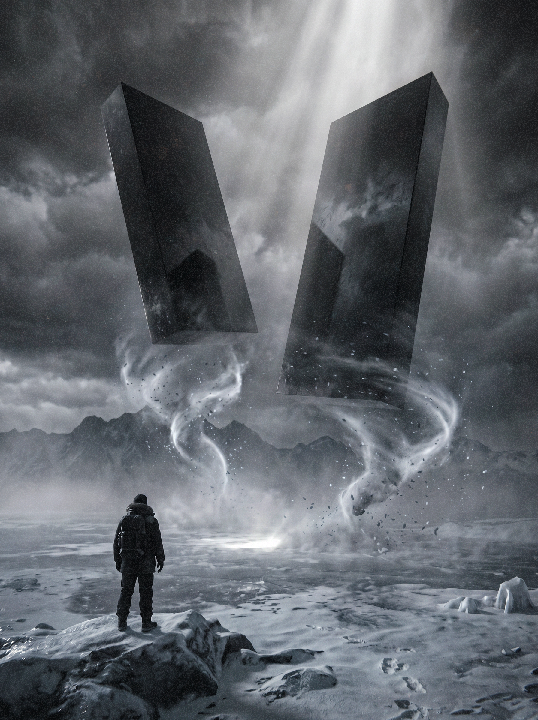
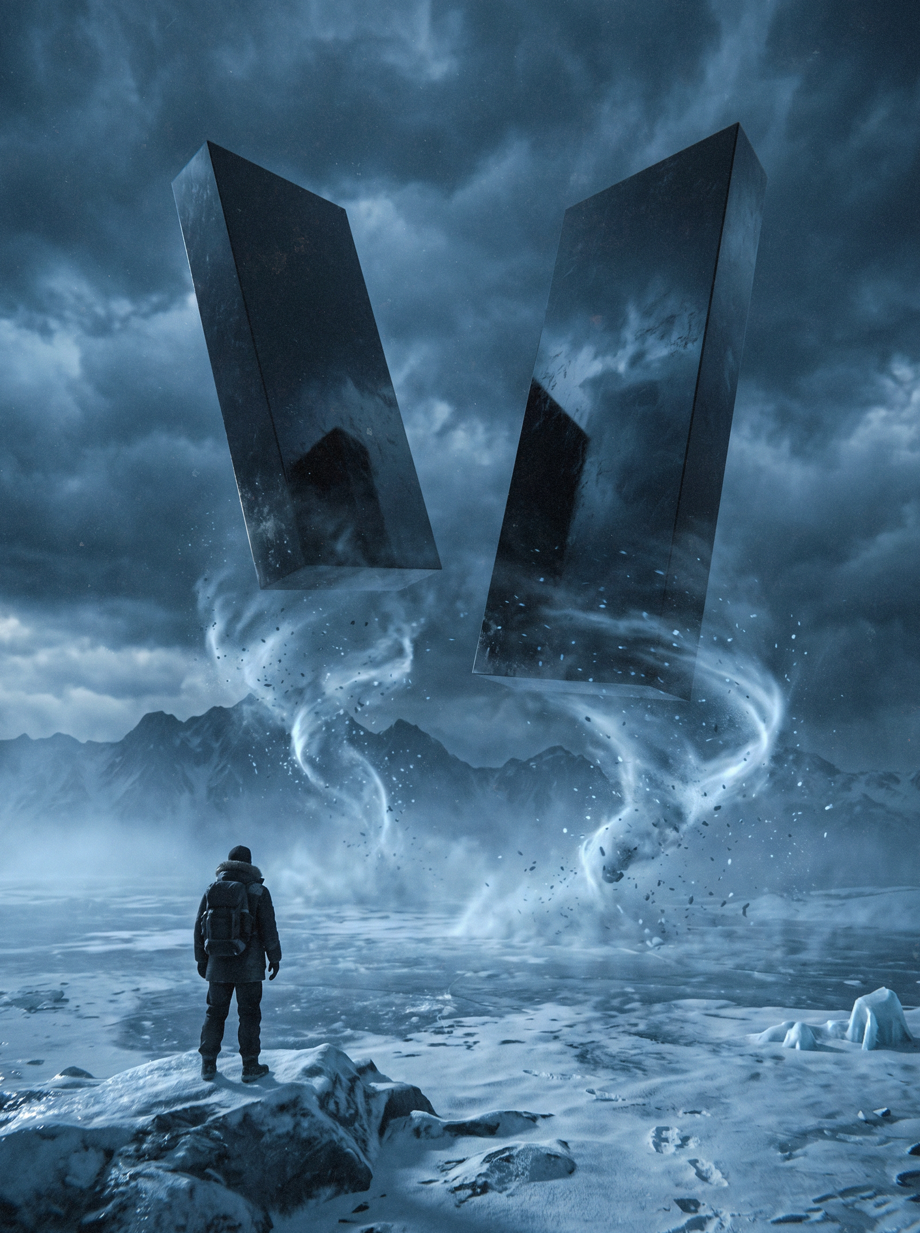
PROJECT BREAKDOWN
This section shows every stage of "The Divide" from grey clay wireframe through to the final cinematic poster. Each image represents one step in the workflow described in this guide.
YOU HAVE THE
FULL ACCESS
Thank you for supporting this work. More guides, breakdowns, and production content are coming. Follow on Instagram to get notified first.
Enter your access code to unlock the complete guide.
After purchase, your access code will be in your confirmation email.
First 100 Instagram YES comments get free access.